Creative Resume Formats: When to Break the Rules (2026)
61% of hiring managers say design matters. When creative formats help, when they backfire, and the two-resume strategy.
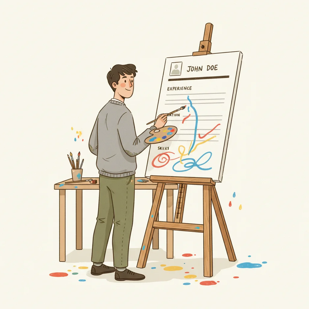
Every job search advice column tells you to use a clean, ATS-friendly resume with standard formatting. And for most applications, that advice is correct. But "most" isn't "all." A Creative Fabrica survey of 1,003 hiring managers in September 2024 found that 61% say a resume's design affects their evaluation of a candidate — and in creative fields, that number is even higher. The Ladders 2018 eye-tracking study showed recruiters spend 7.4 seconds on an initial scan, and in that window, a well-designed creative resume can capture attention in ways a standard format cannot. The catch: the same creative choices that impress a design director will get your resume rejected by an ATS system before a human ever sees it. This guide maps the full spectrum from traditional to creative formats, tells you exactly which creative elements are safe and which are career-ending, gives you an industry-by-industry breakdown, and introduces the two-resume strategy that lets you get the best of both worlds.
The Design Paradox: Key Numbers
of hiring managers say resume design affects their evaluation of a candidate
Creative Fabrica, 1,003 HMs, Sept 2024
average time recruiters spend on their initial resume scan
Ladders Eye-Tracking Study, 2018
Here's the paradox: design matters, but the wrong design kills your chances. Hiring managers notice your formatting — and they notice it in less than eight seconds. A creative format that enhances readability wins. A creative format that prioritizes aesthetics over information loses. The question isn't whether to be creative — it's how creative you can be while remaining functional.
The Resume Format Spectrum
From Traditional to Creative: Five Levels of Design Risk
No formatting. Used for ATS text fields and email body submissions.
SafeClean layout, standard fonts, subtle color accent. One or two columns.
SafeAccent colors, custom section dividers, icons for contact info. Still text-based.
ModerateCustom layouts, skill bars, progress rings, branded header. Heavy visual design.
RiskyCharts, timelines, icons, heavy graphics. Entire resume is a visual artifact.
RiskyMost job seekers should stay in the "Standard" to "Modern" range. These formats look professional, parse correctly through ATS systems, and still allow enough visual distinction to stand out. The "Designed" and "Infographic" levels are specialist tools — effective in narrow contexts but dangerous as defaults.
ATS Compatibility: What Survives the Machine
ATS-Safe Elements
Standard fonts, single/dual column layouts, bold/italic text, bullet points, horizontal lines, simple tables
Always parseableUse With Caution
Accent colors, custom section dividers, small icons next to contact info, subtle background shading
Test firstATS-Breaking Elements
Text inside images, skill progress bars, charts/graphs, multi-layer columns, embedded fonts, text boxes
Often failsThe core issue is simple: ATS systems read text, not images. Any information embedded in a graphic, chart, or image-based element is invisible to the parser. Skill progress bars are the most common offender — they look impressive but communicate nothing to the machine reading your resume. If the ATS can't extract your skills, your resume gets ranked lower regardless of your qualifications.
Industry-by-Industry: What Format Works Where
| Industry | Recommended Level | Verdict | Notes |
|---|---|---|---|
| Graphic Design / UX | Modern to Designed | Creative OK | Your resume IS a portfolio piece. But also submit a standard version for the ATS. |
| Marketing / Advertising | Standard to Modern | Some creative OK | A subtle accent color and clean layout show taste. Don’t overdesign. |
| Tech / Engineering | Standard | Keep it clean | Engineers want information density. Design should never compete with content. |
| Finance / Law | Standard to Plain | Avoid creative | Conservative industries read creativity as unprofessional. Content is everything. |
| Healthcare | Standard | Avoid creative | Precision and clarity mirror the qualities the industry values. |
| Education | Standard | Minimal creative | Clean and readable. A tasteful header is fine; infographics are not. |
The best creative resume is one where the design serves the content, not the other way around. If someone remembers your layout more than your qualifications, the design has failed its purpose. Creativity on a resume should be invisible — it should make your experience easier to read, not harder.
The Risk/Reward Matrix
Low Risk, High Reward
Clean two-column layout, strategic use of one accent color, well-chosen professional font pairing, clear section hierarchy with bold headings. These subtle choices make your resume stand out without triggering any red flags with ATS or conservative hiring managers.
Medium Risk, Medium Reward
Custom header with your name styled as a logo, small icons for contact information (phone, email, LinkedIn), colored section dividers. These work for creative roles but may confuse some ATS parsers. Always test before submitting.
High Risk, Low Reward
Skill progress bars, timeline graphics for work history, charts showing “percentage of expertise,” photos on resumes (in the U.S.). These elements impress no one who’s actually hiring and break most ATS systems. The risk-reward ratio is terrible.
Context-Dependent
Infographic resumes, portfolio-style layouts, and heavily branded personal documents. These are legitimate tools for graphic designers handing a resume directly to a creative director — and career-ending mistakes for anyone submitting through an online portal.
The Two-Resume Strategy
The professionals who get this right don't choose between creative and traditional — they maintain both. One version is optimized for machines; the other is optimized for humans. The key is knowing which to deploy in each situation.
Machine-Optimized
Standard format, ATS-safe fonts, clean single or two-column layout, no graphics, no images, all text parseable. This is what you submit through online portals, career sites, and any application that goes through automated screening.
Use for: Online applications, job portals, recruiter submissionsHuman-Optimized
Designed layout, accent colors, custom typography, portfolio-style elements. This is what you bring to in-person networking events, send directly to hiring managers who've already shown interest, or attach to a follow-up email after initial contact.
Use for: Networking, direct outreach, follow-ups, portfolio sites6 Creative Format Mistakes
Using an infographic for online applications
Infographic resumes look impressive to humans but are largely unreadable by ATS systems. Your skills, embedded in charts and graphics, won’t be parsed — and you’ll be ranked at the bottom or not ranked at all.
Skill progress bars
A bar showing “Python: 85%” communicates nothing useful. 85% of what? ATS can’t read it, and hiring managers find it arbitrary. List skills as text with context: “Python (4 years, production ML pipelines).”
Using color as the only differentiator
If your section headings are only distinguished by color (not size, weight, or position), they’ll disappear when printed in grayscale or parsed by an ATS that strips formatting. Design should work in black and white first.
Including a photo (in the U.S.)
Outside of acting and modeling, photos on U.S. resumes create legal liability for employers concerned about bias claims. Many companies explicitly instruct recruiters to reject resumes with photos.
Prioritizing white space over content
Some creative templates sacrifice a third of the page to margins and decorative elements. In a 7.4-second scan, every square inch of readable content matters. If your design reduces content density, it’s hurting you.
Designing for the wrong audience
A beautifully designed resume submitted through an online portal is a wasted effort. The first “reader” is a machine. Save your creative version for situations where a human will see it first.
Our AI tailoring tool reads the job description and rewrites your resume to match the employer's language, using only your real experience with zero fabrication. Resume Studio includes 55+ ATS-tested templates across 6 layout types — from clean and traditional to modern with accent colors — so every design choice is pre-validated for ATS compatibility. Change tracking shows exactly what was modified and why. The ATS score checker gives you a 0–100 match score before you submit, so you know your formatting and content are both working.
Creative Format Checklist
Before You Use a Non-Standard Resume Format
Sources & References
Ready to stop sending the same resume everywhere? Get New Resume uses AI to tailor your real experience to any job description — with full change tracking so you always know what was adjusted and why. No fabrication. Just translation.
More articles
How to Handle a Demotion on Your Resume (Without Raising Red Flags)
14% of professionals have been demoted. 5 strategies to present a title change without raising red flags.
How to Write a Resume When You're Overqualified (Without Getting Filtered Out)
70% of employers consider overqualified candidates but 75% worry about motivation. 6 strategies to reframe overqualification.
Should You Include a Photo on Your Resume? (Global Guide 2026)
In the US, a photo can get your resume rejected. In Japan, leaving it off can. A country-by-country breakdown of resume photo norms.
Want to go deeper?
Browse all articles